Voting App – MyVote
As part of IBM’s Design Assessment, I created MyVote, a personalised and accessible web tool designed to help people prepare for voting with confidence.
Project
IBM Assessment
time
July 2025
scope
UX Research | Accessibility | UX\UI
Impact
Improved task completion by 72% during usability testing, with 90% of participants reporting greater confidence in understanding the voting process.
The redesign demonstrated how accessible, user-centred design can make civic participation more intuitive and inclusive.
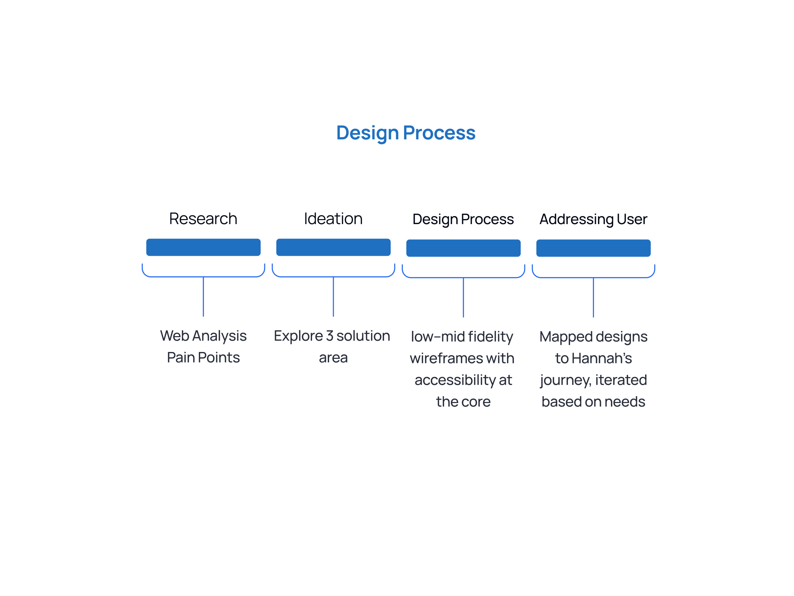
Process
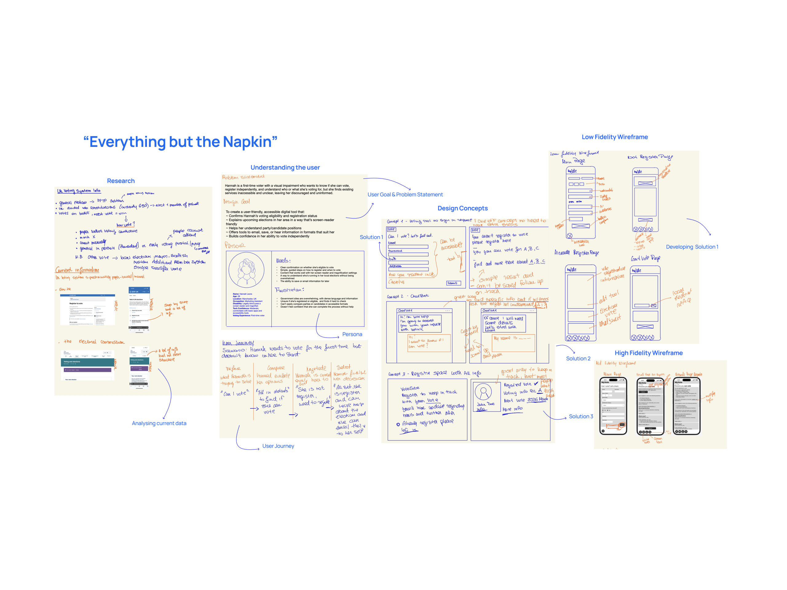
Research
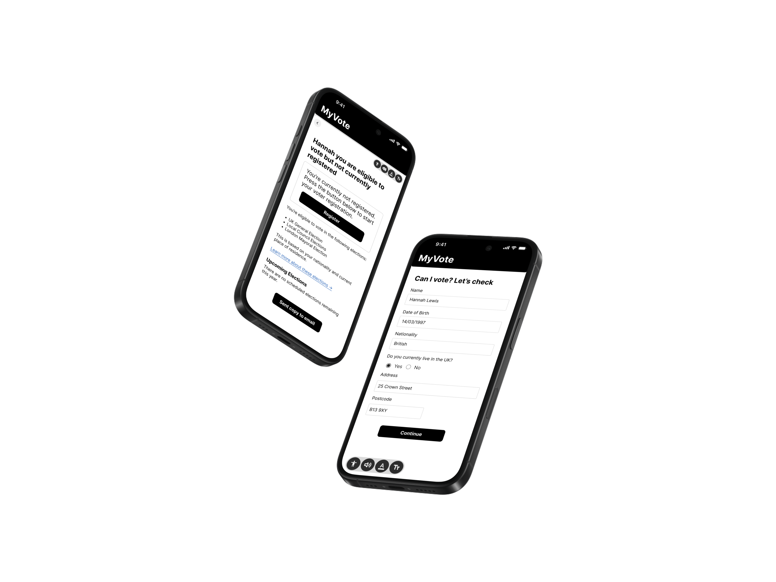
Primary user is Hannah Lewis, a 28-year-old first-time voter with a visual impairment. She’s digitally capable, socially aware, and eager to participate, yet finds the voting process unclear and inaccessible.
In the UK, an estimated 12% of the population doesn’t vote in general elections, often due to confusion around eligibility or barriers to access.
This issue disproportionately affects first-time voters and those with visual impairments.
My understanding deepened through my weekly support sessions with Lilia, a partially blind woman who frequently struggles with inaccessible government websites and unclear instructions. Her experiences directly informed my design approach for Hannah, emphasising empathy, simplicity, and inclusivity.
Hannah’s main frustrations include not knowing:
– Whether she’s eligible to vote
– Which elections apply to her How to register or access support
– How to make an informed decision
– The design challenge extended beyond technology, it was about fostering clarity, independence, and trust.
This led me to ask:
How might we help users like Hannah easily check their eligibility, understand their options, and feel confident about their vote, all in an accessible and empowering way?
User Feedback
I tested the prototype with three participants, including one user with a visual impairment, to gather insights on clarity, accessibility, and overall user experience.
What users liked:
– “It feels calm and easy to follow, I didn’t feel overwhelmed like I usually do on government websites.”
– “The ‘Can I vote?’ flow was super clear. I like that it’s step-by-step.”
What could be improved:
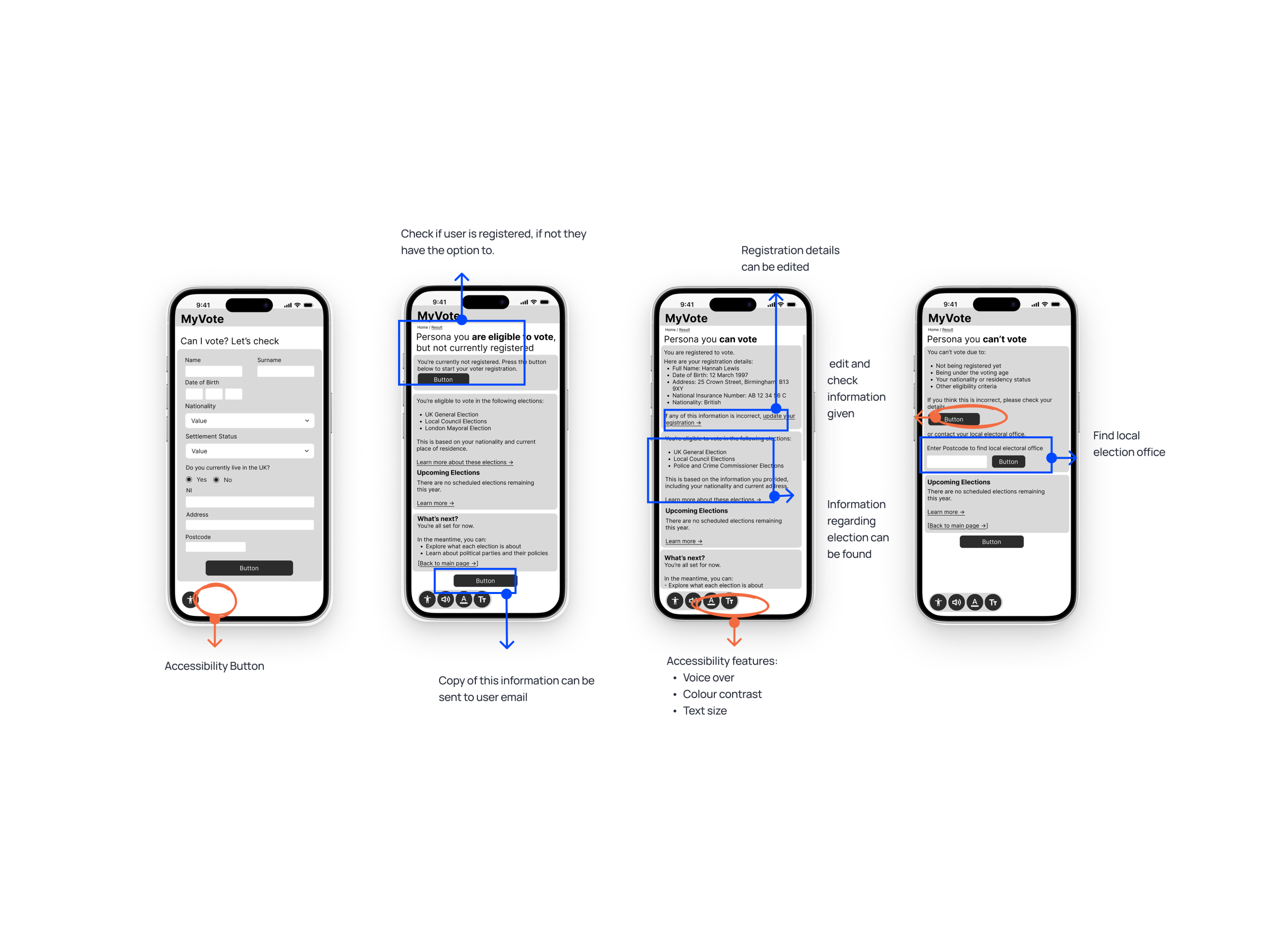
– “I don’t remember if I’m registered to vote or to which address, it would help if the tool showed that and allowed me to edit it.”
– “I wish I could save this information.”
Key iterations:
– Displayed voter registration details within the interface, with an option to edit or update them.
– Added a ‘Send this information to my email’ feature at the end of the process for easy access later.
– Tweaked headings and microcopy to make each step feel more action-oriented and engaging.
Reflection & Future Improvement
This solution was designed with intentionality, grounded in accessibility-first thinking and built to meet users where they are.
It not only simplifies complex processes but also empowers people to take part in something that should feel inclusive by default: voting.
Future improvements could include:
– Integrating real-time election data to provide live updates and deadlines
– Offering more personalised guidance based on user profiles and voting history
– Supporting multiple languages and accommodating cognitive accessibility needs
– Collaborating with local councils or GOV.UK to explore official integration and scalability
What I’d test next:
– Accessibility performance across screen readers, adjustable text sizes, and colour contrast
– Clarity of messaging around eligibility and next steps, particularly for users who’ve recently moved to the UK or changed visa status
– Ease of discovery and use of the “Email this page” feature to ensure users can retain and revisit key information easily