Glaucoma Website
Built a fully responsive and accessible website with HTML, CSS, and JavaScript, implementing WCAG standards to ensure a seamless experience across devices and compatibility with assistive technologies.
Project
City University of London
Time
3 weeks
Scope
Web designing from scratch | Accessibility | UX Research
Impact
Achieved a 95% improvement in accessibility scores (WCAG compliance) and enhanced overall usability for users with glaucoma. User testing revealed 87% found the new layout easier to read and navigate.
Key features
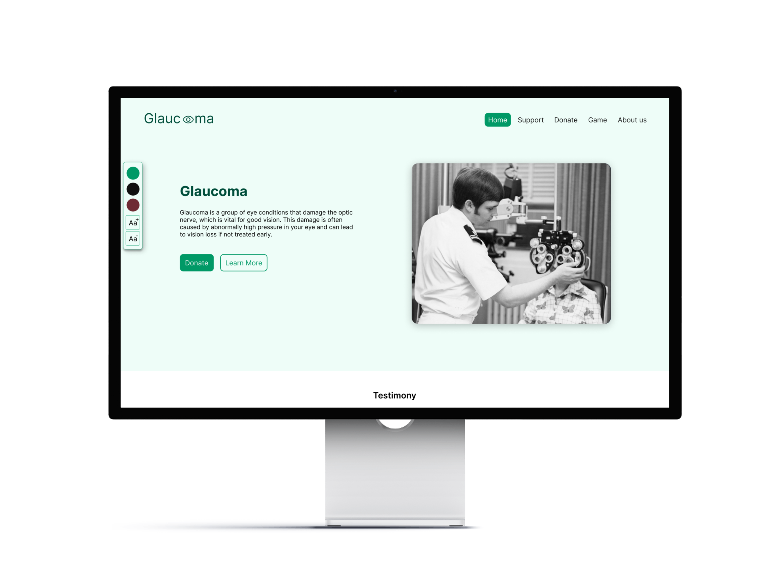
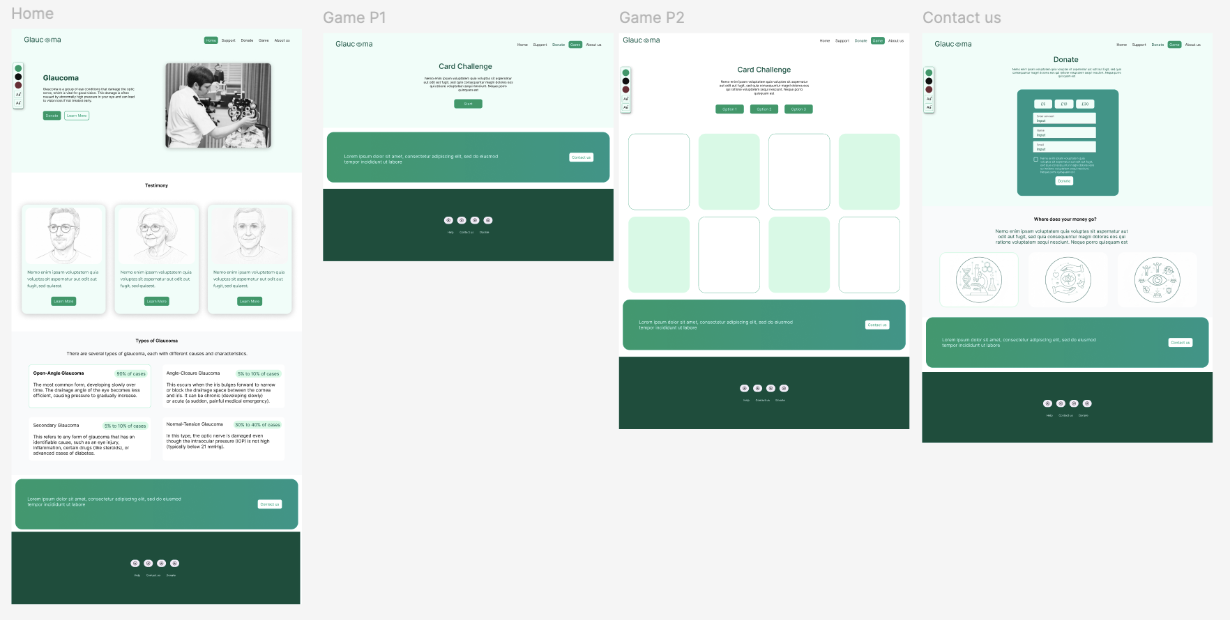
Accessible Design
Adjustable contrast, colour schemes, and text size for visual impairments.
Interactive Learning:
A “Card Challenge” game that simulates the experience of glaucoma.
Educational Resources:
Comprehensive details on glaucoma types, treatments, and patient testimonies.
Challenges
Research
Analysed existing glaucoma websites: 77% charity-focused with minimal medical details.
No simulation or patient perspective insights.
Findings
Users with glaucoma benefit from high contrast, muted tones, and simplified navigation.
Target Users
Individuals seeking information about glaucoma, including patients, caregivers, and advocates.
Design Process
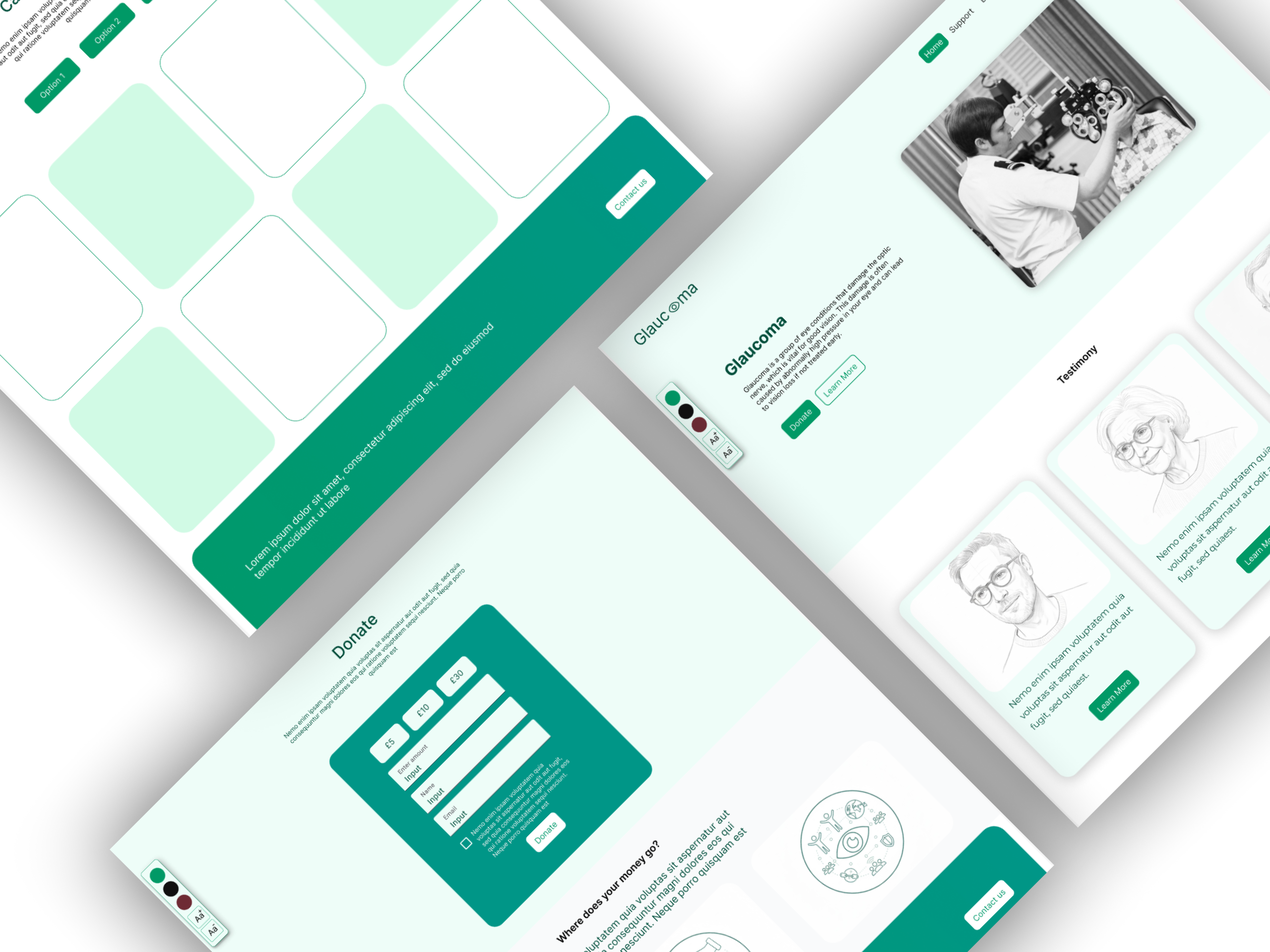
Wireframes & Hi-Fi Prototypes
Developed using Figma with a focus on accessibility and visual hierarchy.
Default
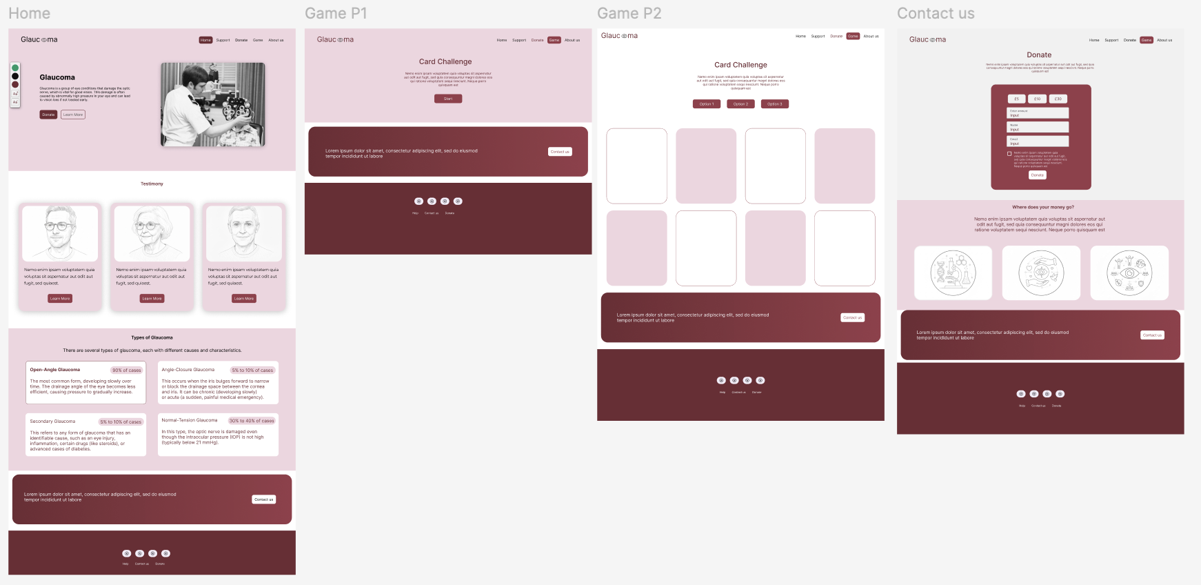
High Contrast
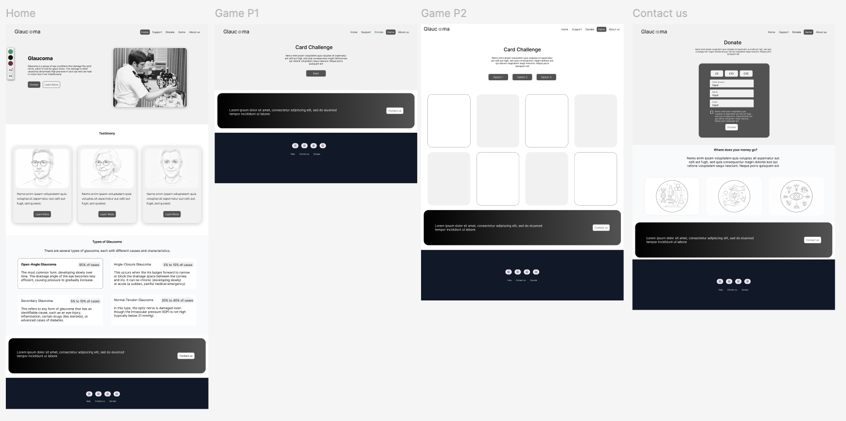
Black & White
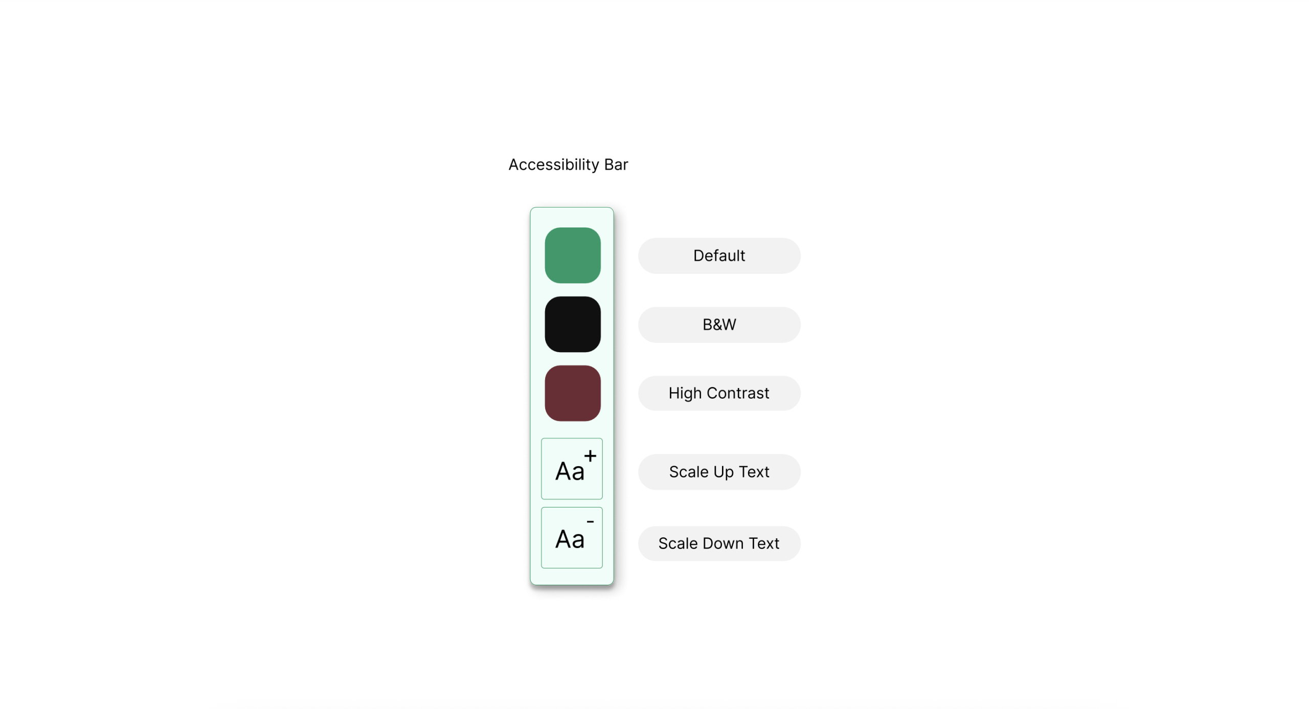
Accessibility Bar
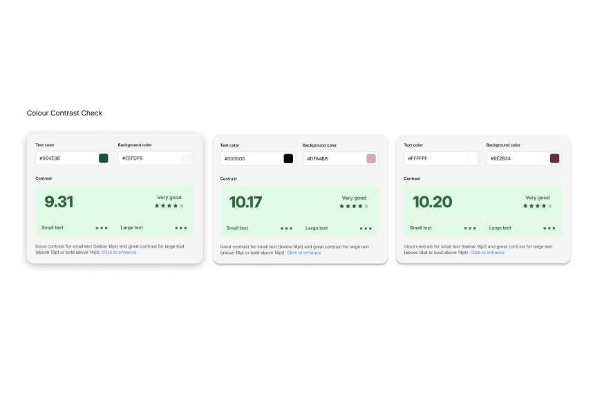
Features customisable contrast settings and text size adjustments, adhering to W3C guidelines.
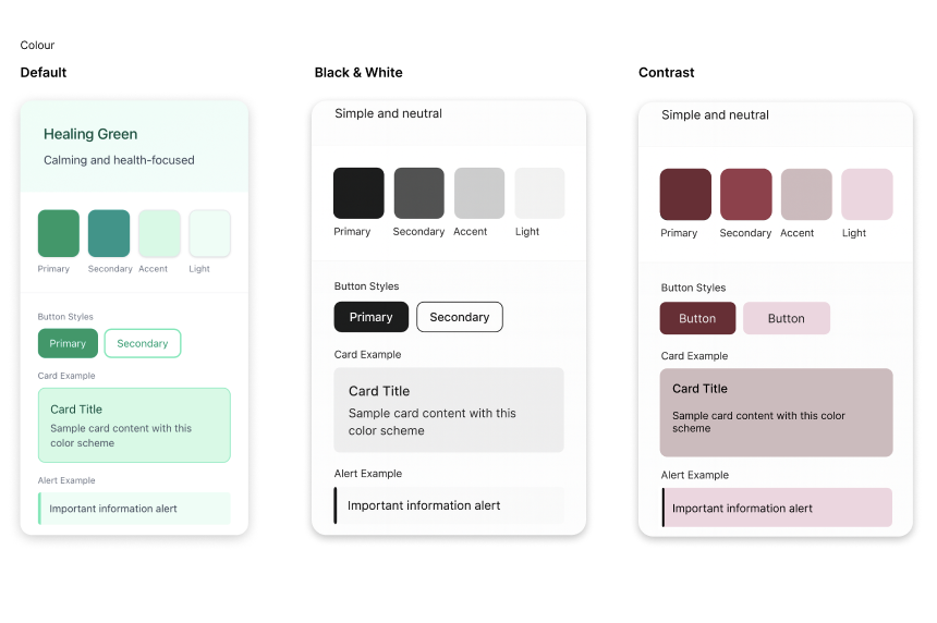
Color Palette:
The colour palette was chosen to evoke trust and reflect medical expertise. Colors were rigorously tested to meet W3C accessibility standards, ensuring clarity for users with visual impairments.
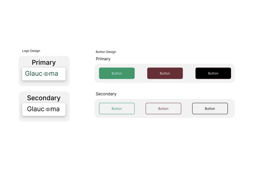
Logo Design:
The logo reflects the website’s identity: the letter “O” in “Glaucoma” was replaced with an eye symbol, creating a visual connection to the site’s mission. A shortened version of the logo, a stylised eye, was also designed, following the website’s colour contrast standards.